Top 10 · Dashboards

Top 10 Dashboard PowerPoint Templates with Examples (2026)

Dashboard PowerPoint templates turn raw numbers into a single, scannable slide — and the right layout determines whether your audience reads the data or glazes over it. The templates below cover the full range of business reporting needs: executive KPI reviews, financial performance updates, sales pipeline snapshots, and operational analytics, all built around chart types that PowerPoint handles natively so you're not fighting the software to make edits.

This list ranks the 10 most-downloaded dashboard templates on PPT-Design, making it a reliable signal of what presenters actually find useful rather than just visually impressive. Each template uses Excel-linked charts where noted, meaning you right-click a chart, hit Edit Data, and your figures update automatically — no redesign required. Whether you're dropping in monthly revenue numbers or swapping department names, the layouts hold up.

When choosing a dashboard template, match the chart count to your data density. A slide with four metric cards suits a tight executive summary; a five-section layout works better for analyst-level deep dives. Also check whether the template uses circular progress charts, gauge meters, or bar charts — each signals a different reading rhythm to your audience.

Free download Fully editable PowerPoint + Google Slides
1 2 3 4 5 6 7 8 9 10
Business KPI Dashboard Blue Analytics Layout
Free PowerPoint + Google Slides 445+ downloads

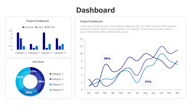
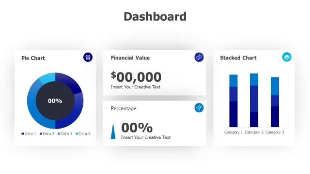
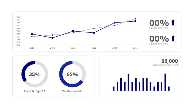
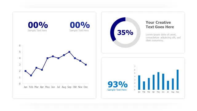
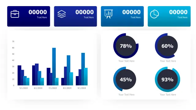
This is the go-to pick for quarterly business reviews. The four metric cards across the top give executives an instant headline read, while the multi-series bar chart below handles month-over-month comparisons without crowding the slide. The circular progress charts in the lower section are ideal when you need to show percentage targets — think NPS scores, budget utilization, or project completion rates.

The blue analytics palette reads cleanly on projected screens and video calls, which is why it leads download counts by a wide margin. Use it when you need one slide that carries an entire performance story.

Financial Performance Dashboard Three Chart Layout
Free PowerPoint + Google Slides 293+ downloads

Built specifically for finance teams, this template tracks revenue, costs, and EBITDA in a single layout — a combination most generic dashboard slides force you to split across multiple slides. The clustered bar chart handles categorical breakdowns (region, product line, quarter), the donut handles share-of-total questions, and the dual-line graph shows two trend series without a second slide.

Pick this one when your audience includes CFOs or investors who expect to see all three P&L dimensions at once rather than clicking through separate charts.

Business Analytics Dashboard Four Widget Layout
Free PowerPoint + Google Slides 256+ downloads

Four distinct widget types in one layout — pie chart, financial value display, percentage indicator with trend arrow, and stacked bar chart — make this template unusually versatile for a single slide. The stacked bar chart is the standout: it lets you show three-category breakdowns (say, new, returning, and churned customers) in the same column, which saves a slide compared to side-by-side charts.

Best suited for analysts who present to mixed audiences — some want the headline number, others want the segmentation behind it. This layout serves both without splitting the deck.

Multi Chart Analytics Dashboard Layout
Free PowerPoint + Google Slides 149+ downloads

The dual donut charts are what make this template distinctive. Most dashboard slides use a single donut for one percentage comparison; this layout places two side by side, making it easy to contrast two segments, two periods, or two business units without adding a second slide. The line chart and bar chart sections fill out the rest of the grid for trend and volume data.

Reach for this when you're presenting a before/after comparison or a two-product breakdown alongside broader performance trends.

Business Analytics Dashboard Four-Chart Layout
Free PowerPoint + Google Slides 126+ downloads

This template sequences its four chart types in a logical reading order: KPI cards first for the headline, then a line trend chart, a donut for composition, and a monthly bar chart for granular volume. That progression mirrors how most executives actually process a performance update — headline, then trend, then breakdown, then detail.

It's a solid all-rounder for monthly business reviews where you have a varied data set but want to keep the slide count at one. The editable KPI cards are particularly easy to relabel inside the PowerPoint slide layout panel.

Multi Chart Analytics Dashboard Layout — Creative Variant
Free PowerPoint + Google Slides

The Creative Variant adds a data table section that the standard multi-chart layouts omit — useful when your audience needs to see the actual figures behind a chart, not just the visual shape of the data. The clean grid keeps the table from overwhelming the chart elements, which is harder to achieve than it looks when building this from scratch.

Excel-linked charts here mean real-time updates via right-click > Edit Data. Best for sales teams presenting pipeline data where specific deal values or account names need to appear alongside trend charts.

Four Metric KPI Dashboard Layout
Free PowerPoint + Google Slides

Four colored metric cards at the top, grouped column charts in the middle, a data table, and a trend line — this template packs the most data layers of any layout in this list. The color-coded cards make it easy to assign one color per business unit or product line and carry that encoding through to the charts below, which is a standard data visualization best practice.

It's the right choice for quarterly board reports where stakeholders expect both summary numbers and the supporting detail on the same slide. Excel linking keeps the update workflow manageable.

Triple Gauge Performance Dashboard Template
Free PowerPoint + Google Slides

Gauge meters communicate urgency and threshold status faster than bar charts — a needle in the red zone reads as a problem without a legend. This template's three gauges in coordinated blue tones work well for operational KPIs like server uptime, customer satisfaction scores, or production yield rates where the target threshold is the whole story.

The accompanying progress bars add a secondary data layer below each gauge. Use this template in operations or IT reporting contexts where showing status against a limit matters more than showing trend over time.

Multi-Chart Analytics Dashboard Layout
Free PowerPoint + Google Slides

The area chart is the differentiator in this layout. Where bar and line charts show discrete values, an area chart emphasizes volume and cumulative growth — making it the right choice for web traffic, revenue run-rate, or any metric where the filled area under the line tells the story. The dual column charts and donut round out the layout for categorical and share-of-total data.

Pick this when your core narrative is about growth momentum rather than point-in-time comparisons. The three-chart variety keeps the slide from feeling repetitive.

Five Section Analytics Dashboard Layout
Free PowerPoint + Google Slides

Five numbered sections with circular icons on the left create an implicit reading sequence that most dashboard templates don't attempt — useful when your metrics have a logical order (e.g., funnel stages or process steps). The central pie chart and right-side line graph give the slide visual balance while the percentage statistics add quick-read callouts.

This template suits strategy or process presentations more than pure financial reporting. If your dashboard needs to tell a sequential story rather than just display parallel metrics, the numbered layout gives you that narrative structure without adding extra slides.

Frequently Asked Questions

What is a dashboard PowerPoint template?

A dashboard PowerPoint template is a pre-built slide layout combining multiple chart types — bar charts, donut charts, KPI cards, and trend lines — on a single slide so you can present key metrics at a glance without building the layout from scratch.

How do I update the data in a dashboard PowerPoint template?

Right-click any Excel-linked chart and select <em>Edit Data</em> from the context menu. This opens the embedded spreadsheet where you replace the sample figures with your own. The chart updates automatically when you close the sheet.

Which dashboard template works best for executive presentations?

Templates with four or fewer metric cards and a dominant bar or line chart work best for executives. They deliver a headline read in under ten seconds. Layouts with too many small charts or dense data tables are better suited to analyst-level deep dives.

Can I use these dashboard templates for both printed reports and on-screen presentations?

Yes. Widescreen (16:9) layouts display well on projectors and video calls. For printed handouts, use PowerPoint's <em>Print</em> dialog set to <em>Pure Black and White</em> or <em>Grayscale</em> to check that chart colors retain enough contrast without color printing.

How many charts should a single dashboard PowerPoint slide have?

Three to five chart elements is the practical range. Fewer than three often wastes the layout; more than five tends to reduce each chart to a size where the detail becomes unreadable on a standard projector screen.

Looking for more Dashboards templates?

Browse the full library of Dashboards PowerPoint and Google Slides templates — fully editable, free to download.

Browse all Dashboards templates