Infographics and data visualization have become very popular in recent years as a means of communicating complex information in an easy-to-understand way. One great tool for creating these visualizations is PowerPoint templates. PowerPoint has many built-in tools that make creating infographics and data visualizations easy and straightforward. In this article, we’ll explore some creative ways to use PowerPoint templates for infographics and data visualization.
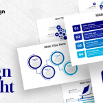
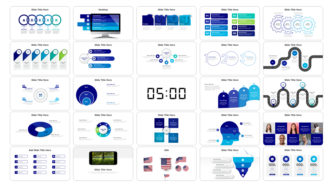
- Use a template as a starting point: You do not have to start from scratch when creating infographics and visualizations. PowerPoint templates offer a great starting point as they provide an already developed design layout. You can use the template to design custom charts, graphs, or tables that fit your data accurately.
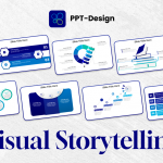
- Take advantage of SmartArt: PowerPoint’s SmartArt tool allows you to create a range of graphs, flowcharts, and other visualizations that can be included in your infographic or data visualization. Use SmartArt to create custom diagrams and charts to represent your data in a visually compelling way.
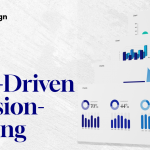
- Play with colors: Use contrasting colors to differentiate data points in your visualizations. Use colors that fit your brand identity or add visual interest to your charts. Using different shades of the same color can also create a sense of hierarchy, making it easier for viewers to understand the importance of each data point.
- Highlight important data points: Use design tools such as shadow or spotlight effects to highlight specific data points. This draws the reader’s attention to the most critical data points and helps them understand the main message of the infographic or data visualization.
- Be creative with icons and symbols: Icons and symbols are an excellent way to represent your data in a more visual way. Use pre-built icons from PowerPoint or create custom icons using graphic design software. Always make use of simple symbols for better understanding.
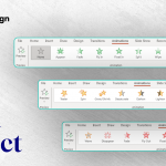
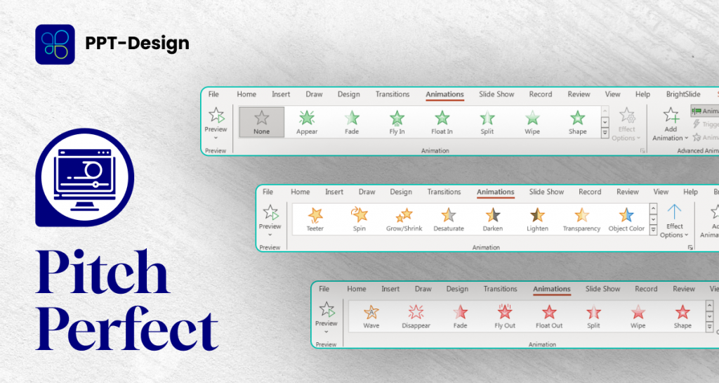
- Use animation and slide transitions: Use slide transitions and animation to bring your visuals to life. Animations can make your visualizations more engaging and help emphasize the critical points in your infographic or data visualization.
- Keep it simple: Keep your infographic or data visualization clean and straightforward. Avoid cluttering the design with unnecessary elements. A clean, uncluttered design is more visually appealing and easier for viewers to understand.
In conclusion, PowerPoint templates offer an array of tools and options that can make creating infographics and data visualizations straightforward and efficient. It’s imperative to remember that the key to effective visualizations is clarity and simplicity. By using color, icons, symbols, SmartArt, animation, and slide transitions creatively, you can create engaging visualizations that convey complex data points in a clear and effective way.
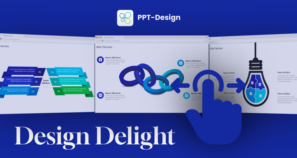
Use our PPT-Design addons to insert fully editable ready-made infographics template, just update your text & you are done


